Microsoft Excel Tips and Tricks
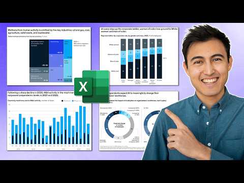
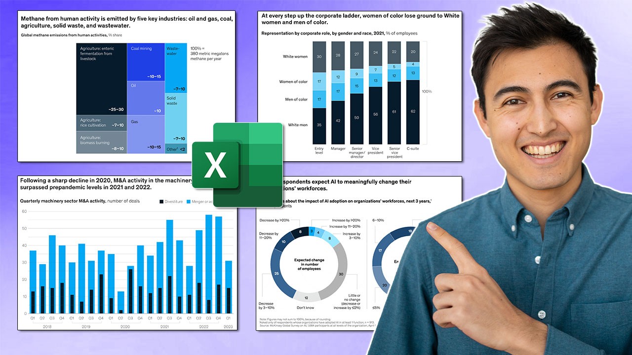
In this video, I make 3 McKinsey visuals in Excel. McKinsey & Company is the most prestigious consulting firm in the world, so they’re known to make some of the best visuals in the industry. That’s why I want to show you how to replicate three of their most popular visuals, in Excel. First, we create a radial bar chart, which is like a mix of a pie chart and a bar chart. You can find this inside of the pie charts section in Excel.
Credit Kenji Explains

